Bicycle Card Design
- Apr 3, 2017
- 2 min read

Reflection Sheet
Miranda Zaransky
1. How does the design that you created demonstrate your knowledge of playing card design?
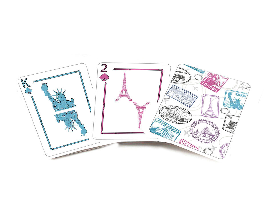
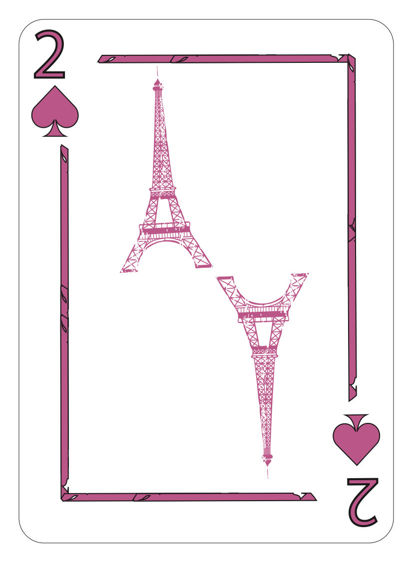
I used a similar layout of how the picture and number cards were designed with the border and all.
2. How would the rest of the deck look? What would you do for the other picture cards? Please describe in detail?
The rest of the deck would be pretty much the same throughout but on like other number cards it would have different famous landmarks and for the picture cards it would have famous landmarks like Mount Rushmore for example.
3. How does your design demonstrate your knowledge of adobe illustrator?
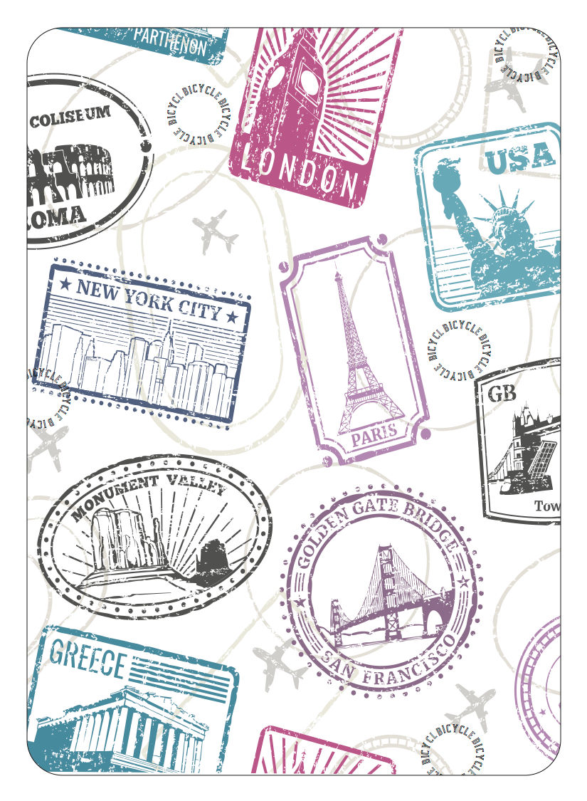
I used image trace a lot and I used the elliptical tool to do the top of the card to create and change the stamps, and for my color scheme since I usually do black and white I felt like it needed some pop of colors so I added that and used the eyedropper tool to make sure my colors were all the same throughout the project
4. What do you feel was the most challenging part of this project and why?
The most challenging part of this project was probably the top of the card because that is where is I had to get all of my ideas from and color scheme. It was hard to create some of the stamps but I figured it out for the most part and used some of the graphics in the top of the card throughout the rest of the cards.
5. If you can change one requirements what would it be and why?
I would take away the Bicycle logo only because when I imagined my top card it didn’t have the logo in it so I had to figure out a way to make it look right and not just place it in a random spot, but it ended up working out.


Comments